Last week before finals, and I'm not worried. I've done a surprisising amount of painting in the second half of the semester and look forward to what people have to say. That being said, I think I might have overworked the large painting with the taped lines. I was trying to get it to look unified while still having the lines there, so, I'll post some pics below and hopefully tell me what you think. In other news, I did an evil clown painting, pretty happy with it. It started as paint scrappings smooshed on watercolor paper, and now reminds me of Pennywise the dancing clown. I finished ( I think) a painting of Rod Serling, who invites us into the fifth dimension. I really like the colors and how I've managed not to muddy them up. Finally, back to poor George Bailey. I added a layer of dark purple in the backgroung of it. it makes the door that George is eyeing fearfully stand out more. I might work on it some more, but for now I like it how it is. I just want to thank Irene Geller for her wonderful review on her blog, it's always nice to get a boost to the old ego. Well, that's all she wrote, ta ta for now!
Didn't realize the stool was in the way, my apologies.
Tuesday, November 27, 2012
I hate beginning posts with I, but since it is about me and things I'm interested in and or care about, I guess it makes sense. Worked some more on the paintings that I showed last week, except for the one with the verical lines splintering the image, update photos will be at the end of the post. I started thinking about my thesis more, and I thought of George Bailey. Who's George Bailey you ask? Why would would I think of him? Why he's the main character in It's A Wonderful Life. Gerorge gets the opportunity to see what the world would be like without him in it, and it's not great. George gets to be in another reality, so to speak, with the help of an angel, second class. I thought, what if George saw a world that was not only not great for the people he cared for, but also everyone in general. What if his very existence held together something that kept things in order. As soon as he was subtracted, things fell into chaos. Well, that's what I'm trying to paint in a new painting. It has George seated at a bar, with the one door boarded over and a chaotic lanscape outside the window behind him. I used a reference for the face, but quickly stopped looking at it. I think I need to work more on it, the colors some just a little too bright. I want the colors to be muddy, but right now something feels off. George should be bright, more colorful than the world he now inhabits. George will surely think he did truly have a wonderful life after a couple minutes in this world I've painted him in.
Tuesday, November 20, 2012
It's nice to have a whole day where you can just relax and paint. Finally finished the first layer of the 36x42 inch painting. It was really fun peeling the tape offf and seeing how what was underneath worked with what I did on the second layer. I think it looks good, but I'm not sure if I want another layer. Started three new paintings today, two of them I actually took pictures of. I'll post the other one I did sometime tommorow. In other news, I like Stephen King. No, you do? I never would have figured that out! I find that when I'm thinking of something to paint or draw I often think of how what I'm drawing or painting will fit into a narrative. That doesn't neccesarily mean that I go out on a quest to do an illustration. I just want to the viewer to be able to look at a painting done by me and develop a narrative from it, which I guess all paintings do to a certain degree. Wht I like most about Stephen King is how he puts his novels and stories in a larger universe(s). For example, in one of Stephen King's newer books 11/22/63, Jake Epping,m a high school teacher, discovers a portal that goes back to September 9, 1958 at 11:58 a.m. So, with some help, he goes and tries to prevent JFK's assassination. Along the way he runs into a town, called Derry, in Maine. That town has been the host to many supernatural occurences in King's work. Perhaps the most well-known is IT. Well, Jake runs into some familiar people from IT, himself sensing that something had happened. This is just one example of how King interweaves his novels. True, some you could read on their own and you would undestand everything. But when you read another book and there are references to another book, including names, people, places and events, it makes it seem like these novels are not dissparate stories but part of a much larger whole. Wow, kind of got a little to into that, didn't I? Well, I guess what I'm trying to say is that for my thesis I would like to have the same connections, references to not only pop culture, but to the paintings themselves. I think this is the most I've ever written in a single post. I'll update this post tommorow with the one painting, but for now here are some new and semi-new works.
Wednesday, November 14, 2012
I've started to work on the big painting that I posted a picture of last time. I'm trying to have areas that look different from each other; in both the way they are painted and the color. Then, I want to remove the tape and continue taping and painting sections until I'm satisfied. I imagine it will take two more iterations. I'm hoping when I remove the tape, what's underneath will unify the image, and give a sense of how many layers there are in the paiunting and give a sense of where it started from. By the way, the BFA reception was fantastic, lots of people there. I hope that we'll be able to carry what we learned from setting up this show and bring it into our Thesis shows. I did some little works that were sold at the silent auction ( well, only Stephen King, Ellen Ripley and Clint Eastwood sold), the photos are below. In a last bit of news, I think I hopefully figured out what I might be doing for my thesis. I'm interested in depicting alternate dimensions or realities. I want them to be cohesive, so throughout the works there will be subtle and not so subtle nods to popular culture that I hope people will be able to see. Long days and pleasant nights ( Stephen King reference, couldn't help myself).
The colors are a jump from what I usually do, I am however worried that it will look too muddy.
Sunday, November 11, 2012
Okay, so below are the new paintings I've been working on. The two smaller ones (18" x 24") are almost done. I like how abstract the one face is while still being able to tell it's a face. Also, I like the feeling that the face is glowing from inside. Started a underpainting on the large canvas, just a face, I might change it. I just wanted to get something down just to get started. I've started my thesis proposal and it's looking promising. It really helps to write down your ideas, not always, because I fear writting a bad idea down and being stuck with it, but for things like this it's good. I knocked out two pages. I'm not really sure yet about the details, what size will the work(s) be, how many, things like that. I have an idea, it might not be the best one in the history of art, but it's one that I find to be interesting and will hopefully allow me to make intersting work. See you next time!
Wednesday, November 7, 2012
I got back to painting this week. I've started mixing more colors on my palette and on the canvas and i'm pretty happy with the way things are going. The colors are more muted than my other paintings, but I think it's a nice change. Anyway, I'll post some pictures, probably Friday of the two paintings I've started. I have a 36 by 42 inch canvas that's waiting, I'm just not sure what to put on it. I do know it's going to be a portrait, just not to sure who I want to paint. Perhaps Barack Obama, he's kind of popular right now. There are some sketches I did during the 4-5 days I didn't have power at the end of this blog post, none of them are finished. I just started on some and then moved onto others. Enjoy!
Friday, November 2, 2012
Well, you know the title of the blog, Morgan's Art and Other Things of Interest, well this falls under the latter category. I just got my power back in Helmetta New Jersey, like literally 20 minutes ago. I've been without it since Monday night at 5:15pm. Well, what was I doing, well, reading, drawing, and going to sleep at 7:00pm every night. My family and I were worried that our apartment might flood like during Irene, but it was fine. Needless to say, I have nothing really artsy to post, next week I'll post some of the drawings I did during my 4 or so days without power. Hope everyone is okay and doing their best. Until next time, see ya!
Wednesday, October 24, 2012
Midterm critique is over! It went good. Things I need to work on: color palette, making it more diverse, using different colors, using different brushes, and perhaps work a little bigger. Also, I need to incorporate more colors were they aren't readily visible. Anyway, I'm glad that it's over, now I can go fourth and make work with these ideas in mind. I want to try and abstract the figure while also making other things like the background more clearer and concise. Hopefully this time next week I'll have pictures of new work to post. For now, here's some work from the midterm critique I haven't posted before.
This painting is close to finished, but not quite there. The skin is too pink. I want to add another layer, add a little yellow to lessen the red. However, I do like the way it makes the green in her eye pop.
I like the lines in this. I love the palette knife, it's my new favorite tool.
This painting is where I started using my palette knife. I didn't like how it was going, so I just added globs of paint with the knife, and I liked it, so I kept going. I really like the green sky and the stars.
Wednesday, October 17, 2012
Okay, so my last post said that I'd tell you what I thought was good and what made me want to claw my eyes out at the current exhibition in the Mason Gross gallery. Nothing actually made me want to claw my eyes out, but there were some things that were just more visually appealing than others. I'll start with the bad. On the whole Robert Nava's paintings were interesting. They were childlike and yet that didn't bother me. It was like a child had been given a huge canvas on which the could make a picture. I've heard people say " My child could do that" in reference to some artworks that appear primitive. And of course someone will retort that a child couldn't do that, because they couldn't think about composition, foreground/background relationships, etc. I kind of disagree, the reason a child couldn't do something like Robert Nava is because no parent would buy/ make a giant canvas for their child to paint on. True, their are parents who want to stimulate their child's growth, but most will settle for crayons and copy paper. Back to the point, I think a child could make a fairly decent painting if given the opportunity. Robert Nava's paintings are depictions of everyday things, through the lens of a child. My real problem is with this painting below:
Okay, it's a police officer or a mail person ( trying not to be sexist) riding a cow, I think. But that's it. Where's the house in the background, wheres the grass hastily put in with green scribbles. All his other paintings are more complicated in the fact that the canvas is filled. Maybe it's just me ( it probably is), but this painting to me feels the weakest of the group because to me it looks like something a child wouldn't do. I have a notebook from when I was in first grade. It's filled with scribbles of superheroes and Power Rangers ( cringing). In all of these drawings, I managed to make it feel like the superheroes were somewhere. Even if I just scribbled something from the superheroes to stand on. This to me just feels like a sketch for a larger painting. I can tell what it is, then I just move on, nothing holds me to make me want to look at it longer. Wow, glad that's over, hope I wasn't too rough. Despite the one bad apple I did enjoy the rest of Robert Nava's paintings, this one painting just brought me down.
The only other painting in the show that I didn't like/ and or didn't understand was this:
I really don't know what to say about Katie Herzog's painting.The background is the most interesting thing, the mix of blues and purples and what looks to me like a footprint. It looks like someone started playing hangman and the lunch bell rang and everyone left before saying any letters. Unfortunately I wasn't able to attend the lecture in which Katie Herzog was the speaker, so I don't know what she was trying to do or say in this painting. I don't want to speculate and come off as a ignorant jerk ( too late haha), so instead I'm going to move on.
My two favorite parts of the exhibition were the works of Aaron Gilbert and Lui Shtini. Aaron Gilbert's figures have an odd manaquinesque ( it's a word) quality about them. I f someone had just cut open my chest, I'd eitheir be screaming bloody murder or be dead and a little more loose. All the figures have an odd calmness to them, despite one being on fire and another being stabbed.
The glossines of the surface of the painting and how rendered everything is also something I liked. Not to say that all the figures are neccesarily realistic, it's just that they have a computer generated quality that's interesting.
Lui Shtini's work also has a highly rendered, computer quality. All the works were interesting, the the painting at the bottom was the one that I looked at the longest, so it's my favorite.
The condoms in a petri dish are simple, then you have these black specks and you wonder what the fuck is that? Is it something growing outside the petri dish, some new lifeform? Is it casting it's own shadow or is it staining the surface of whatever it's on? I'm still scrtatching my head but I like how it gets you to step closer and try to see what's happening.
Well, that's all she wrote. I could have went further, but this is a blog and not a full length feature article. Next time I'll have another update of my studio and tell you all how my midterm critique went! See you next week, same bat time, same bat channel!
Wednesday, October 10, 2012
Okay, so here are the pictures of my last two paintings, then three I'm currently working on. The one's a landscape, because I'nm getting just a little tired of people at the moment, even though this painting has a figure at the bottom right.
I decided to add text to the bottom ( bad photo, I apologize), the text is from the opening sequence of the tv series Carnivale. It seems to me that he's talking to you, not giving you a warning neccasrily, but maybe a history lesson.
I love the face, you can tell it is a face without to much rendering, it's slightly blurred, like it's not completely there or completely still.
This one was just an exercise, I'm not really sure what I;m doing with it just yet.
For this one I wanted to try and use some realistic skin color, mainly just to see if I could. This photo sucks but Ilike how the color of the skin brings the green out in her eye. The reference I'm using the woman in it has suffered from eitheir a stroke or some kind of facial paralysis. I want to extend the blue lines more into her left side, make it look like it's spreading or has spread.
Again, little tired of the figure, so I decided to paint a red mountain with a green sky, with a red and blue moon, oh and a guy being impaled by a tree in the head, then it spreading to his hand and going up the mountain. Weird, huh?
Next time I'll talk a little about the current exhibition at the Mason Gross galleries, what tickled my fancy and what left me wanting to claw my eyes out.
Wednesday, October 3, 2012
Okay, so I finished the two paintings I showed previously, I'll have pictures up by the weekend. I'm trying to think about ways to complicate the compositions I use in my paintings. After talking to Marc Handelman and my mentor Zack I think I need to start considering my composition more than I'm used to. Usually I have an idea for an image, then bam, I paint it. Most of my figures are plop dead center of the canvas, which to be honest is starting to get annoying. It's just when I start painting I tend to go to the center. Most times the backgrounds come into play as a whimsy or a happy accident. I don't really think about them as carefully and in context with the whole painting. Hopefully the next couple of paintings I do will try to tackle this problem I have. As to how I will tackle it, I have no answers at present time, if anyone has any ideas, please share! The next issue is surface, which again, I don't think about, or at least not as much as I should. All my paintings are dry. I use the minimal amount of coats of gesso than begin painting. For me it's about the image in my head and getting it on canvas. So, I'm going to try different surfaces and hopefully try to do different things with color ( quit using cerulean blue). Hopefully I'll be able to do this and not go back to default with my painting. Now time for the pretty pictures from my sketchbook.
Remember the sketch I did of the skull lady? Well. here's another one, she's not dead center ( well okay, kind of), but I like how I'm considering more than just one figure.
This is a sketch for a painting I'm currently working on. No, she's not making a funny face, her left-side of her face is paralyzed. I'm beginning to get interested in the idea that something in the body can be broken, like the brain, but you can still function, albeit with a little adapting and adjustment.
Tuesday, September 25, 2012
Okay, so here are some pictures of my studio and what I'm currently working on. There's two paintings and some miscellanaeus drawings and what not. Warning: my camera sucks, so don't make any harsh judgements based on these photos. For those, come visit my studio. Oh, my studio is on the third floor, 11-12.
So this painting I'm almost finished with, still want to add something. The face is Michael J. Anderson from Twin Peaks and Carnivale. I'm really happy with how the face is coming out, it's like he has something important and knowledgable to say and you better listen up. I didn't realize this but the head looks like it's on a hill, something I did realize thanks to Teresa. I was thinking about incorporating text, but I haven't figured out how to do it. Although I think I might try doing some more to the robe/hill to try and add text, hey maybe headstones. I could type out the text but I'd rather show you where it's from ( hint: it has to do with one of the shows mentioned above. the best part about the video is the spanish subtitles!:)
My studio setup.
I don't know what I'm doing with the painting on the left. I like the face, and of course the boobs are awesome, but I'm trying to fire out what else I want to do with it. She's kind of dead center so I kind of backed myself into a corner as to what I can do with the rest of the painting.
Another view of my studio, hopefully it won't look so barren and sad soon.
Wednesday, September 19, 2012
So here are some sketches I've been working on, didn't crop them or edit them, just scanned them. I want to use the skull lady in a painting, just thinking of what I'd do with it. I already know green is going to be in the background, somehow. The guy was just my attempt to try and break my typical forward facing figure drawing. Some anatomy is off probably but it's a good starting point. Any suggestions? Comments? Questions? Answers???
If you want to read the notes, go for it, but they mainly consist of artist names and notes from painting class.
I really like this one, hopefully I'll get it to where the blackness behind her becomes something other than crosshatched blackness.
Okay, so i've started on two paintings thus far this semester. I know it will be hard to follow without pictures, but try anyway. The first is a figure, a woman. I started with red and yellow for her body and cerulean blue as a background. I grew unhappy and decided to start over. so, I went to white it all out and the white did an interesting thing to the colors, so I decided not to give up on it just yet. the second painting is a portrait. basically I was inspired by the show Carnivale and the opening monologue of the first episode in the series. So, it has Samson in the middle of the canvas, just before he begins speaking. I've added a background, but I'm not quite sure what i want to do with it just yet. I might add the text of what he says into it somehow. I really like the way the face is coming along, trying to get every wrinkle. I'm not sure how these two works will fit into my thesis, which at the moment is undetermined, but I'm sure I'll figure something out. I'll post pictures of the works as soon as I find my camera.
Saturday, September 15, 2012
This is the work of Dirk Dzimirsky. He does hyperrealistic portraits and figures. The big thing to me is his use of tinted paper, which to me would allow a greater range of values, both light and dark. I wonder how long it takes him to finish a drawing? Fllow him on his deviantart page http://ddzim.deviantart.com/ or at his website http://www.dzimirsky.com/ .
"Art history is a bowl of alphabet soup, the artist reaches in and spoons out what letters he wants..."- William De Kooning, asking Barnett Newman which letters he wants. Taken from Barnett Newman edited by Ann Temkin, pg, 32.
Wednesday, September 12, 2012
Interview with Irene Geller
This is an interview I did with fellow artist Irene Geller. Check out her blog at Irene Geller Art . Below is the transcript and some images. Enjoy!
Irene Geller: Hiii, my name is Bob! That’s not normal.
Me: That’s not normal?
Irene Geller: Tha’ts- that’s normal.
Me: They way I’m speaking now is normal, or the way you’re speaking before is normal?
Irene Geller: Oh, the way you’re speaking now is normal.
Me: Okay!
Irene Geller: So you’re a painter, right?
Me: Yes.
Irene Geller: Well, so- what medium do you paint in the most?
Me: Oil. I hate acrylic. I absolutely despise it, because my first year of painting at community college, we used acrylic, and I hated it. So that hate has come over to Mason Gross, and I’m glad I still hate it, otherwise I wouldn’t be able to do these lovely paintings in oil.
Irene Geller: Oh, well I feel awkward now because this [points to painting behind her] is in acrylic.
Me: Oh no, it’s okay, it’s just a personal preference.
Irene Gellar: Oh okay.
Irene Gellar: For me, I work in oil too, primarily, and I actually only started using it when I came here as well. Due to lack of… something, possibly having a place I can actually work with it.
Me: When did you first realize that you wanted to be an artist? When was the first time you said, ‘I wanna do this.’
Me: There’s the cliché answer (that’s true), and there’s the more relevant answer- definitely as a kid I wanted to be an artist- so, amongst other strange things like “spiritual leader” [shrugs.] But it was maybe sophomore year, it was an artist lecture here, I don’t even remember the artist’s name, but I was sitting there and everything that he was talking about and all the images he was showing, and I was like, ‘Yeah- It’s pretty boss to be an artist. I am definitely going to do that.”
Irene Geller: What kind of concerns or issues or images move you to produce your work? What makes you want to make a painting?
Me: When I see something weird, like something that kind of creeps me out, I wanna put that in oil. Or even just sketching it so I get the idea down.
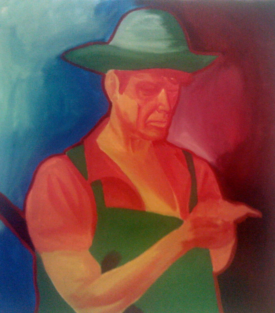
Irene Gellar: Is that the same thing that happened with this painting? [points to it]
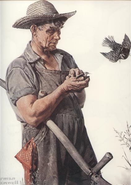
Me: Yeah, this was actually inspired by Norman Rockwell’s “Farmer and the Bird.” It’s a nice painting, but it was kinda, not colorful. I mean it’s nicely painted, nicely rendered—
Irene Geller: — it’s Norman Rockwell.
Norman Rockwell's Farmer and The Bird from The Saturday Evening Post. I really love the painting but like I said in the interview the colors are a little blah!
Me: Yeah. But I was like, I wanna make it- more colorful!
Irene Geller: Yeah you definitely accomplished more colorful. It’s very… pop-y.
My version of Norman Rockwell's painting.
Me: How would you describe your work in one sentence?
Irene Geller: In one sentence?
Me: Well not one sentence, but just a general idea.
Irene Geller: Let me try one sentence. That’d be funny. Let me think… sits here for three hours.
Irene Geller: My paintings are very confused.
Irene Geller: How would you describe your work in one sentence?
Me: [thinking]
Irene Geller: See, it’s not that easy.
Me: It isn’t. I’d say, “Color,” because.. with my drawings, I’m concerned with the form and value, and in my paintings I’m all about the color. I probably could paint a normal portrait, with normal colors, but I’m like, “That’s boring… I want her skin to be bright blue.”
Irene Geller: So do you think Matisse or Picasso- they’ve been influences, or no?
Me: Uh, I think Matisse- but I have trouble remembering, you’ll have to show me a painting.
Irene Gellar: Yeah, he tends to be very colorful and has these almost arbitrary color choices, like a green stripe down the nose, or other things.
Irene Geller: Why do you go towards the colors that you use? Like in this one- [points to painting] – what are you thinking about?
Me: I think like what colors… wanna HURT you the most. [looks at his work] So the green against the red and the orange against the blue and the yellow- I’m just thinking of complementary color, I’m trying to push that.
Irene Geller: Is there maybe a psychological level to the color choices that you’re making? Like you said you want them to “hurt” you—
Me: — I kind of want you to look at them and- Nyehh [cringes and turns head away]. But then look at it again like- [makes surprised face and gasps.]
Me: What about grad school, or do you want to start working [after you graduate]?
Irene Geller: Just job-wise, I know that I want to keep teaching- like I have a job already teaching, so I’m going to stay there. [pumps fist and mouths “yeah b---ch”] No cursing… So I want to do that. I don’t think I’ll go to grad school immediately, just based on different people that I’ve talked to. I decided it makes much more sense to force myself to work and get out there on my own… So I’ll just be finding the most practical, livable solution for me to do that, and that does not include going to New York like most people kind of think—like, “I’m gonna go there now and be an artist!”
Me: Yeah, it’s the same with me too. Like I’m kind of afraid of New York… I’m like Macaulay Culkin when he first gets there like—[gasps, makes scared face] “I’m in New York??”
Irene Geller: [attempts Culkin’s shocked face on cover of Home Alone]
Irene Geller: Have you ever seen a painting (it could be in a New York gallery) that as soon as you saw it, you hated it? Like very very visceral HATE?
Me: I wouldn’t say HATE—
Irene Geller: –Hate’s a strong word?
Me: Yeah, hate’s a strong word, it’s more like- What? What, why? What are they doing? Like I have no idea what this person is trying to do.
Irene Geller: What was it, do you have a specific memory?
Me: Not a specific painting- oh no, no, wait, I do—
Irene Geller: Okay, and describe it please.
Me: A canvas… painted entirely black!
Irene Geller: … is that Ad Reinhardt?
Me: I’m not sure, but it was just- I know I may be ignorant or like, not up to speed with art in my mind but—okay. Black and white [wall.]
Irene Geller: Yes. Good contrast, though.
Me: What are your favorite artists? Like which ones do you look to for inspiration?
Irene Geller: Um, there’s a couple of them, I could give you a more generic type that I like. I have one painter in my mind, Angela Dufresne—
Irene Geller: –recently I was reading about this British artist, Greyson Perry who is a “man—” [adopts silly accent] –but he dresses in cute dresses! And he- y’know, he has really like adorable fashion. And he walks around and he goes to shows and parties that way, so— [speaks normally] there’s no reason for me using this accent.
Me: You should use it, it adds something.
Irene Geller: [adopts accent] For the whole interview?? I can do that! Um, so, he wears these dresses and I think I just like artists that kind of, are surprising in a way and they do these unusual things that maybe society tells us that we’re not allowed to do, and they usually push things—[regular voice] usually gender and sexuality issues are what attract me, or things that are strange within that- like you said, something strange that grabs your attention.
Irene Geller: Like for this [points to painting behind]- this is in a music video for Kyary Pamyu Pamyu, she’s a Japanese artist, the video/song is called “Candy Candy,” and she’s dressed like that with this cute pink hair and outfit, but then in the video there is –clearly a guy- he’s, k’know, three feet taller than her, and super bulked up, and he’s dressed the same way, only he wears a mask [for an anime face.] And while she’s doing all these cute moves, he’s walking around like— [does parody of uber-masculine, ape-like walk] dressed in the same cute outfit. And it’s very bizarre, like you watch it and it throws everything else off about that video. So artists that push boundaries in gender and fashion and societal norms, that type of thing.
Me: Okay, so this is weird, but—
Irene Gellar: Weird is fantastic—
Me: I wanna know, if you could buy one art supply, no matter what the cost was, like it could be $1,000 a liter, money was no object, what would it be?
Irene Gellar: I would buy tons and tons and tons and tons, and tons, of rolls of printmaking paper. BFK Reeves, white… I forget what the count is but it’s the best paper ever. As you can kind of tell I like painting on flatter surfaces, not canvas as much, I have an allergic reaction to canvas when I have to deal with it.
Irene Geller: What about for you, what would you buy?
Me: LIQUIN. I love LIQUIN. Cause when I first started painting in oil it was like watercolor, I couldn’t manage to get the paint on really thick. But Liquin, the way it flows… once you mix the oil, it’s nice, it’s so nice, I love it. I wish they had more sales for it at Utrecht.
Irene Geller: Do you have an ideal kind of art work? Like the opposite of the question if you saw something you really didn’t like, maybe you’ve seen a work that you thought, “This is perfect, this does everything I ever wanted to do?”
Me: Well, yes and no. I like David Kassan, he paints mainly representational oil portraits. His portraits are real like photographs, but the backgrounds- they just doesn’t make sense, you don’t know where they are. It’s all these marks- it’s weird to me. The person is just in an abstract environment…
An example of David Kassan's work. The amountr of detail that he puts into his portraits is amazing. You can chack out various videos online that show him at work, true they're sped up, but it still shows you how he does it.
Irene Geller: Does it look like there’s a painting behind them, or is it a weird unknowable texture? Me: Yes, a weird unknowable texture. They’re perfectly painted portraits against that, it’s really weird to me, and I love that. Irene Geller: Do you know George Condo? Me: No. Does he live in a condo? Irene Geller: Ha ha ha… yes he does.
A picture of the artist George Condo.
Irene Geller: Is there something in your paintings that you really are trying to go towards? Like an idea? Me: I would really like the values and the forms- I want them realistic, but then have the colors be so outrageous that you’d be like, “Okay, if I went to some alternate universe, that might be realistic, but here, nooo.” Irene Geller: But is there maybe a reason behind doing that, like you said it’s an alternate reality, that’s kind of interesting— Me: I’m into that kind of thing, alternate realities and all of that. Irene Geller: Do you play video games, sir?
MS: Yeah… it’s interesting to me, like the idea of things being different- that not all the possibilities are necessarily right here, that things exist that we never dreamed were possible.
IG: Well that’s sort of like science fiction. So maybe you’re painting science fiction paintings. Me: Yeah yeah, a little bit, I wanna push that— Irene Geller: [looks at his work] Like this is the last farmer… on Mars… and he’s like, “I’m gonna kill myself now…”
Me: What do you like to read, and does it inform your painting? Irene Geller: Sort of, I guess in the sense of “disjointedness,” like in [points back] this work, people’s first reaction is like, “Oh, what a cute girl,” then they look at it longer and “There’s something not quite right here…” Irene Geller: One book, “One Hundred Years of Solitude,” by [Gabriel] Garcia Marquez, and it’s the story of this family somewhere isolated in South America, through a hundred years it follows their family, but it’s written like a constant run-on sentence and weird things will happen out of nowhere- one daughter walks out[side] into the courtyard and she looks up in the sun and, “God decided to take her [up to heaven], and she disappears and never reappears for the rest of the novel. So, “What actually happened just now?” It’s called magical realism in reviews of the book; things happen in the book and everyone inside just accepts it as completely and utterly normal, as you’re sitting there wondering, “But what ACTUALLY happened?” You’re sort of forced to accept that reality. Irene Geller: Another one with the run-on sort of style is “Bright Shiny Morning” by James Frey, who’s infamous for other reasons but that doesn’t matter- or it does. It follows people going into California, like a drunk hobo who lost all of his family, or people escaping from their abusive families in the Mid West, or super rich actors, or a Mexican maid… and it’s this run-on style that jumbles everything together, like this big crazy pile of meanings. Me: What do you think are some of your strengths and weaknesses?
IG: Well properties like color and form—I wouldn’t say color is completely a weakness, but I can think about it more—I usually go from my gut, or I have an idea off the top of my head when I begin something and I go with that. But some formal things like composition and considering space a little more- usually I go with what my intuition tells me. I know pretty well conceptually what I’m interested in, but I need to work on formal things like that.
Irene Geller: What about for you, same question [strengths, weaknesses]? Me: I think expanding my colors is something I try to do- like I mainly stick to yellows or oranges, greens, blues, reds, I don’t try to mix my colors- I mean, I try, but most of these colors are pretty much straight from the tube. I just try to get it down quickly, just mixing the color is too— Irene Geller: Well that could be something—like for me I had issues painting with canvases, one issue I can see in your painting [points to it] is that your edge is not painted in, and that’s what messed me up, like “Do I want to paint it? Yeah, but I hate—but do– ?” So it was this huge conflict so I decided to paint on something that doesn’t have an edge- or doesn’t have too much of an edge to deal with. Irene Geller: So maybe the fact that you don’t want to mix these colors could be, a strength in some way? Like you could twist it and make it really useful. Y’know, look at George Condo, he mixes his color, but sometimes they seem like they could also be out of the tube, and sometimes they’re very flat, like some areas in your painting…
Irene Geller: Have you had any critical, eye-opening experiences since you’ve been here? Me: I think, the professor I had last year, Richard Baker, he- I wasn’t really sure when I first started painting were really different and I think bad, I was trying to do naturalistic colors [makes”ehh” face]. Then I started doing these and Richard said I should keep going with it, keep pushing the color, keep pushing what you’re doing—
[room lights turn off] Irene Geller: Uh oh. Irene Geller: Is there a time period or movement or some way of working in art history that you identify with? Or maybe, you kind of do but you don’t completely like it? Or—[looks at intruder] Don’t walk into the camera, dear… Alexis Cherry/Intruder: Oh.. yeah! Irene Geller: [gasp] It’s a camera, hiii! Alexis Cherry/Intruder: Sorry… Irene Geller: I’ll see you later. So is there [an artistic] time period that you identify or struggle with? Me: I guess I like the Renaissance because that’s when they first started trying to study [the body,] started trying to paint everything “right,” like anatomy, facial features. Da Vinci just started making notebooks and notebooks of anatomical drawings, he really looked at everything… he looked at… fetuses, pregnant women— Irene Geller: –and he cut up people… Me: –He cut up people, just to find out how things work— Irene Geller: Well I have to ask you, do you want to cut people up? No?— Me: No… I mean, Irene Geller: –I’m joking… but thank you for taking that question seriously! Me: It might be interesting just to see how things actually look that way and see how they work, but… [makes grossed-out face] … If I really really wanted to, I could just look it up [in a book]… Irene Geller: Yeah, things are nice and clean in this era… Or century or whatnot… Me: I mean, but I think that the idea of just trying to look for new things—or look at things differently, or try to go deeper, that’s something that I want to try to do. Irene Geller: So that’s something that you do want to pursue in your own work, right? Me: Yeah. Irene Geller: Do you have any idea of how you can begin going about that? Me: As of now… no, but I’d like to try. Me: I was reading a book and one person asked another, “Do you believe in art for art’s sake?” Irene Geller: I vaguely remember who said that… I don’t remember his name right now, but maybe the guy who drew…a mother… it’s a very blue painting but anyway, Art for Art’s Sake… kind of yes?— Me: I mean, just doing art and not worrying about if you’re gonna get paid [for it] or if it’ll support you— Irene Geller: –oh, in that way. There’s a lot of ways you can interpret that sentence. Just doing it for the heck—yeah, because I plan to have my own job that will actually support me more or less, and I’ll find other money-making ways that will keep me eating food and living under a roof… I wanna have my art on the side, just for the sake of actually doing it. Irene Geller: A friend of mine’s boyfriend… she knows who I’m talking about– has been recently saying, “There’s no real reason to have art anymore,” it’s kind of a waste of time, and money and effort, and we should be working towards helping other people out… But I think art is a very important thing about being human— Me: Yeah— Irene Geller: Do you have something to add to it? Me: I think art—if you see something that, if it’s even something that just brightens up your day, that’s’s something you’ve done for someone, that’s good— Irene Geller: Yeah, it’s like someone identifying with the painting that you’re doing, so [silly voice] they feel less lonely in the world… Me: [laughs] Yeah. Irene Geller: Do you have any weird studio habits? That could mean anything… Me: Usually when I work in my sketchbook, I have a habit of not finishing something—like I’ll do half a face and usually won’t go back to it. Irene Geller: [puts hand over left side of face] So you have this much of a face left? Me: Exactly, exactly. I might go back and finish it, but not usually. Irene Geller: What if you did a painting of someone’s half-face? Me: I’ve thought of that, just doing half a face and refusing to finish it… Irene Geller: It’s like Da Vinci decided, “I’m gonna make this nice and decent but… oh, I don’t wanna finish the rest of it,” and just left it kind of hanging there… Well that’s cool. Do you have a silly question you wanna ask me? Me: Um… are you in any way related to Sarah Michelle Gellar? Irene Geller: ………………… [mimics shooting self in head] Irene Geller: Imagine Mason Gross is all yours for one day, right— Me: [looks with awe and wonder at the studio around us] Irene Geller: –nobody’s here, you can do whatever you want with it, like you can transform it or something… what would you do? Me: What would I DO? Oh my god, what WOULDN’T I do? I—I’d put in a little food area [muffled].. Irene Geller: A food what? Me: A food area— Irene Geller: Oh okay. Me: I mean, just where it has food so you don’t have to walk— Irene Geller: Like actual legitimate food? Not corn syrup and like, whatever— Me: Just like… deli sandwiches, or something, I dunno… Irene Geller: [laughing] Me: — Have it where everyone can have their own studio space if they wanted, or they can share it with people, that’s fine too… Irene Geller: We could turn EVERYTHING into a studio— Me: — have it so you can have more stuff that’s actually here, so you don’t have to go to Utrecht, they provide—oh my god, they provide CANVASES for you, or stretcher bars, or— Irene Geller: Or paper!! Me: Or paper for you! So you don’t have to go out and get everything. So I’m going to ask you the same thing: What would you change? Irene Geller: I would… make this… a very colorful and glittertastic… kind of playground—[points to offscreen dancer] Yes, yes she’s got the idea! She’s going—[waves arms fancifully] Alexis Cherry. Me: [whispers] Alexis Cherry. Irene Geller: Ooo. I would basically make everything much more colorful because I’m tired of this white/black/grey checkered thing… It needs to be like neon yellow, it needs to be like your painting and my painting barfed on everything and made it much better—and there needs to be like, a slide—like instead of the balcony over there above the third floor, there needs to be a slide leading down to it… I’m totally copying this off of some artist’s exhibition… just, slides, everywhere. And magical Willy Wonka elevators. Me: That would be more fun because I hate taking the stairs, I’d rather slide down… Irene Geller: There you go. So, I’ll work on the color part, you work on having the food and supplies. [fist pumps] Me: [fist pumps] Irene Geller: Okay, thank you very much—[shakes hands] Me: [shakes hands] We can get it done! Irene Geller: Yes! …Yes we can! ….That was not a political endorsement. Me: Yeah, no, sorry… Irene Geller: We’ll make someone cryyy… Me: We can just cut it off there. Irene Geller: Okay, yeah!